

The evolution of the Starbucks siren logo
Beyond the maritime inspiration behind the company's name and logo, the siren was selected to reflect Starbucks' hometown: Seattle. Situated right on the waterfront, the city boasts a rich maritime heritage, largely due to its prominent fish markets. These elements contributed to the siren becoming the official emblem of the brand.
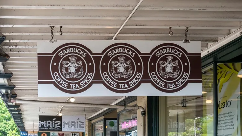
While the logo has consistently featured a siren since the company's founding, its design has undergone several transformations over the years. The original logo was brown and depicted the siren in full. In 1987, the color was updated to green, and the siren's shape was made more symmetrical, along with a slight modernization of the artistic style.
In 1992, the siren received another redesign. This time, the logo shifted to a close-up view, omitting the lower half of the siren's body. The most recent updates to the logo occurred in 2011, when all text was removed, and minor refinements were made to the siren's face and hair.
Recommended

How FDR Considered Hot Dogs A Meal Fit For A King (Literally)

Why Olive Oil From Other Countries Tastes Different

The First Fast Food Restaurant To Add Bacon Cheeseburgers To Its Menu

What Makes Antipasto Different From Charcuterie?
Next up