
Transformation of the Quaker mascot over time
There are whispers that the character is inspired by William Penn, a Quaker from England who moved to North America to seek religious freedom and founded Pennsylvania. While this theory makes sense, the company has never officially verified it. PepsiCo, the current owner of Quaker, has clarified that the mascot is not based on a real individual.
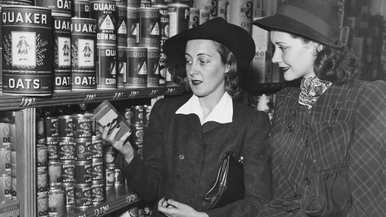
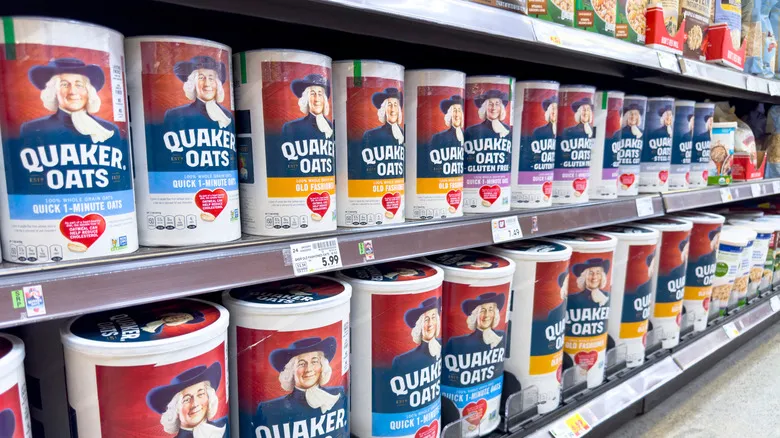
Nonetheless, the mascot does have a name—Larry. In 1946, Larry's full-body portrait was transformed into a black-and-white headshot. He retains his wig, hat, and traditional attire, but now features a friendly smile. The logo was enhanced with color in 1957, and the design we see on boxes today is quite similar, with minor updates to the colors and font. The latest revision appears to have occurred in 2012, which included some color adjustments and a slight slimming of the mascot's face.
Using vibrant and colorful characters on cereal boxes is an effective marketing strategy to create positive associations with certain cereals among children. So, who is the Quaker man aimed at? He lacks the vividness of other mascots and is simply a man—not an animal, cartoon, or mythical figure. Given that Quaker offers straightforward products like traditional oats and grocery store granola, it’s reasonable to conclude that the brand is targeting parents and health-conscious consumers who resonate with Quaker's values. To enhance the flavor of your Quaker oats, be sure to avoid these common mistakes.
Recommended

Pepsi Is Bringing Back Its Legendary Pepsi Challenge To Kick Off Super Bowl Weekend

Why It's Illegal To Bring The National Fruit Of Jamaica Into The US

Where Does Shake Shack Source Its Buns From?

The Scientific Reason Bacon Tastes Good With Everything
Next up